Graphic Design — Baby Dummies — Alexander Rodchenko 1923

“Baby Dummies” created by Alexander Rodchenko and Vladimir Mayakovsky in 1923, was a unique propaganda poster in the style of an advertisement for dummies for children. Rodchenko, a Russian artist, and Mayakovsky, a Russian and futurist poet, worked together through 1923–28 during the recovery of the Soviet Republic after WW1 and the civil war.
The verse by Mayakovsky roughly translates to “There are no better dummies. Suck them ’til old age. Sold everywhere”. This verse sounds very blunt and sharp for an advert for a baby product, which is unusual as you would normally see nursery rhymes or soft verses instead. This helps to convey the idea that it isn’t actually an advert but in fact a propaganda poster instead.
This poster was created in a futuristic and cubist style, which was revolutionary at the time, and came together to help create a movement called Constructivism, created in Russia, of which Rodchenko was a big part of, along with Vladimir Tatlin, the founder.
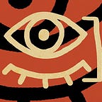
The actual poster joined the abundance of propaganda posters being made in Russia at the time, but was so unlike other typical pro-war posters. “Baby Dummies” features a cubist style baby made from simple shapes and sharply divided colours. The baby is featured with grenade pins and bullet shells in its mouth, and rolled back eyes and sharp pointed fingers, which gives it a really grotesque and grim look/feel.
This poster is the opposite to other posters of its time, as many typical posters feature normal looking people, usually a woman or a woman and a baby, both of them crying, suggesting that the men should join the army to fight for their families. The “demonic baby-of-war”, with its grenades and bullets in its smiling mouth suggest that the baby is happy to be fed the ‘nutrients’ of war. It suggests the idea that the wars in Russia are creating these monster children, who are becoming insensitive to the ideas of violence and death, and the poster is so clearly against the idea of war.
Another idea is that the grenades in the child’s mouth symbolise that the Russians are being silenced by the war, as it takes away their chance to speak out for themselves. This poster is a huge criticism of war.
Rodchenko was a big supporter of the Russian Revolution and was a leading Bolshovik artist, but he became disappointed in what the revolution was becoming and of what his superiors were supporting, and he expressed this in his poster. The purpose of this poster was to express his views and disappointment in the Revolution he had supported for so long. It was a political gesture and statement, and I think through its differences in the typical posters of its time, it works really well to get a reaction from people.

His work was really all very similar to this. It came from the same idea of creating a simple advertisement with a deeper meaning. Most of these deeper meanings related to his opinion on war and the USSR, with the example of “Dobrolyot”, a promotional poster urging people to buy shares of Dobrolyot, a Russian Airline. The text on the poster read “Dobrolyot is creating commercial planes. And they are the basis for growth of the USSR.” This poster was clearly created before “Baby Dummies” as you can see his opinion on war changes. He goes from trying to get people to fund it, to displaying it as a horrific thing, creating monster children in his country. His work also usually features two “main” colours with black accompanying them.
The idea of the extremely basic and graphic poster was because it was necessary at the time in Russia. Russia was an extremely illiterate country with few people being able to properly read and write well. This meant that designs had to be simplified and with few words to confuse. I think this is why his poster is so successful: his simple poster with such a blunt and to-the-point statement contrasts a lot with the posters we have in Britain nowadays. It creates such an unknown and different style poster and I think this is why it works. The colours also help to be eye catching and the strange graphic of the baby also contributes to catching the eyes of the public.